Website Design Principles That Actually Affect Results
Plenty of website design advice is preference dressed as principle. A smaller number of decisions reliably change what visitors do, and they are mostly unglamorous: what is visible first, whether text can be read, and how many steps stand between someone and the thing they came for.
This guide covers the ones with evidence behind them and names the ones that are genuinely a matter of taste.
One clear hierarchy per screen#
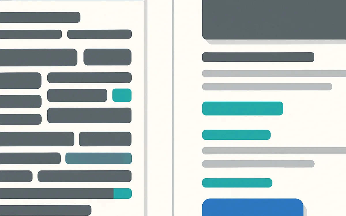
Every screen should make one thing obviously most important. When three elements compete for attention with the same weight, visitors resolve the ambiguity by leaving.
Hierarchy is built from size, weight, colour, spacing and position — in that rough order of strength. Space is the most underused: an element with room around it reads as important without needing to shout.
- One primary action per screen, styled differently from everything else.
- Secondary actions present but visually quieter — outline instead of filled.
- Headings that describe content, not clever ones that describe nothing.
- Space used deliberately: a crowded page has no hierarchy, only density.
Readability before decoration#
Text that is hard to read costs you readers regardless of how good the writing is. These are measurable thresholds rather than opinions.
| Property | Practical target | Why |
|---|---|---|
| Body text size | 16–18px on mobile | Below 16px iOS zooms on form focus and small text loses readers |
| Line length | 55–75 characters | Longer lines make the eye lose its place on return |
| Line height | 1.5–1.7 for body copy | Tight leading reduces reading speed measurably |
| Text contrast | 4.5:1 minimum, 7:1 better | WCAG AA; grey-on-grey fails outdoors on a phone |
| Control contrast | 3:1 against the background | Users must be able to see where an input ends |
| Paragraph length | Three to four lines | Long blocks are skipped on mobile |
Check contrast against the actual background, including gradients and images. A value that passes on white can fail on the hero it is actually placed over.
Design forms for completion, not for symmetry#
Forms are where most website goals are actually completed, and where most design attention is not spent. Every field you add costs completions; every field you remove is free money if you did not need the data.
- Ask for the minimum you need to respond. You can ask the rest in the reply.
- One column. Two-column forms cause skipped fields and are worse on mobile.
- Labels above fields, always visible — placeholder-only labels vanish as soon as typing starts.
- Correct input types and autocomplete attributes so phones show the right keyboard and offer to fill.
- Validate on blur, not on every keystroke, and put the error next to the field.
- Never clear the form on an error. Losing typed answers is the most common reason people abandon.
- Say what happens next after submission, and how long it takes.
What is taste and what is not#
Being clear about the difference saves a lot of review-meeting time. The left column is arguable; the right column is not.
| Taste | Not taste |
|---|---|
| Colour palette | Contrast ratios against the real background |
| Typeface choice | Body text size and line length |
| Illustration style | Whether images have meaningful alt text |
| Hero image or no hero image | Whether the primary action is visible without scrolling |
| Rounded or square corners | Whether focus states are visible for keyboard users |
| Animation style | Whether animation respects prefers-reduced-motion |
| Layout density | Whether touch targets are at least 44px |
Frequently asked questions
Does "above the fold" still matter?
Not as a rule that everything important must fit there — people scroll, and have for twenty years. What matters is that the top of the page answers "what is this and is it for me?" within a couple of seconds. If it does, visitors will scroll for the detail. If it does not, nothing further down gets read.
How many fonts should a website use?
Usually one or two families, with weights doing the work that extra families would. The practical reason is performance rather than taste: each additional family and weight is another file to download before text renders correctly. A single well-chosen family with three weights covers almost every site.
Is dark mode worth building?
It is worth it if you can do it with design tokens from the start, when it costs very little. Retrofitting it onto a finished site means auditing every colour, every image and every shadow, which is a real project. If you support it, respect the system preference by default and let the user override it.
Should the design match competitors?
Conventions should match — navigation at the top, basket at the top right, logo linking home — because breaking those costs comprehension for no gain. Everything above conventions is where you differentiate. The mistake is copying a competitor’s layout wholesale, which usually imports decisions that suited their content and not yours.
website design principlesweb design best practicesux design principlesform designwebsite readabilityvisual hierarchy